Based on what I had researched in my third blog post, I wanted to work on familiarizing myself with the Adobe Suite. Although I have worked with Premier Pro and After Effects before, I’m not as comfortable working with them as I am with Photoshop, InDesign, and Illustrator. After Effects is more used for shorter videos or animation, which is more relevant to social media, so I went with that. It was also something I wanted to dabble in for quite a while already, and decided now would be the perfect opportunity to improve on my skills.
I wanted to start small and make something personal, so I thought about making wallpaper for Google Chrome. I was inspired by a Korean artist called @aube_blue on Twitter and a picture of tulips I happened upon on Pinterest. I wanted to create a sense of serenity whenever I launched the browser to do my assignments, so it would have to be calming to look at.
Figure 1: Inspiration | Source: @aube_blue on Twitter and @anahi on Pinterest
I wasn’t exactly sure where to start, but I knew I wanted to build some sort of scenery so I started by looking at pictures of more tulips and had the idea of making a field of flowers. I started with loose drawings of tulips, then added bluebells (I’m not sure how accurate to nature this is, but I just went with it), and traced everything on Adobe Illustrator. I ended up with 3 elements: two tulips (I’m pretty sure are of a different species), bluebells, and exactly two blades of grass. These were duplicated a few times, then arranged until they looked semi-decent.
Figure 2: Initial sketches and Tracing outcome arrangement
Then I duplicated this until I got a whole row of flowers. To make it more flower field-esque, I added a gradient background for the sky. I felt like it looked pretty empty so I added a second row of flowers above as well.
Figure 3: First Draft
I didn't quite like my first attempt, as it just wasn’t fitting the image I had in mind. I liked that there was texture, but the lines were too thick. It was getting pretty late at this point so I decided to just sleep on it, and try to fully imagine what I wanted it to look like. I started on it again the next day and added the same gradient effect the sky had to the flowers. I messed with the line weight slightly and it ended up looking better with thinner lines, but I still wanted to have some sort of texture or organic movement conveyed. I played around with the effects until it looked like this:
Figure 4: Rows of flowers (2 variations, one with still lines and the other with organic movement)
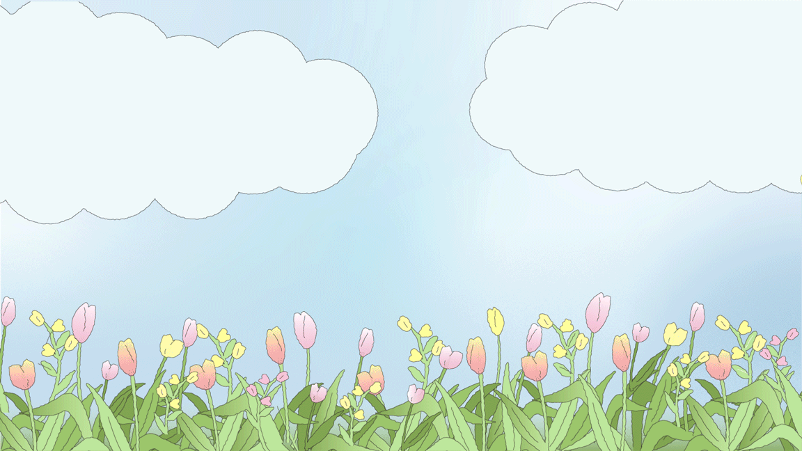
It was starting to come together at this point, so the rest came about pretty quickly. The sky still looked empty, so I added some clouds and butterflies.
Figure 6: End result on Illustrator
Now that the final image was done, I moved it over to After Effects and applied a wiggle effect. After some struggling, I realised I had to separate each item into a separate layer and apply the effect one by one, as the point of movement was different for each object. I was frustrated that I had to redo everything, but I was also equally stubborn to see this project through and gritted my teeth through it. Eventually, after 2 or 3 times of going back to Adobe Illustrator to fix this, I managed to get it (mostly) right.
Figure 7: Final results
I’m happy with the end result of this, but I missed out on some details in this, which I plan to fix when I have more time on my hands later on. Overall, I think I’ve really enjoyed learning about this, and I’m definitely more familiar with the Adobe Illustrator to After Effects pipeline. A key thing I would do differently would be to:
-
Organise my objects by layer and not type. I made the mistake of only looking at the layers panel and organizing everything, which just messed up the whole image.
-
Group my objects early on. When I was tracing the objects, I didn’t group the whole flower together. Basically, the leaves, stalk, and flower were on different layers which made things very hard to find and animate.
This project brought me more clarity on how I work, not just in a designing sense but also my creative process of how I come up with ideas and overcome challenges. I find that I am more aware of when I am overwhelmed and when I need to take a breather. I also figured out that I tend to get too fixated on the idea I have of something in my head, which could be good and bad. It could be good because it drives me to be better so I can achieve that, but it also means I can get very inflexible. This would make it difficult to work in teams, and also means I may overlook or dismiss alternate outcomes.
Documenting my process helped me realise that this characteristic of mine didn't need to apply throughout the whole project. I did have an initial idea of how I wanted this project to turn out, and I was fixated on it which made me change my original draft. However, the second draft turned out different than expected even though it was not exactly what I wanted. It wasn't better or worse, just an alternate outcome which I ended up liking anyway.
I'm aware this isn't something that can be changed overnight, but I'm much more aware of this tendency when I work now, especially in groups. It keeps me on my toes, basically, and I try harder to be more open-minded when I work.
Animating From Scratch
Blog 6
10 FEB 2022


.png)
.png)
.png)